
I have created a more personal site here! Check it out for updates, more portfolio work, and more.
Danny Mancuso:: Home
Identity update.
Just been working on some more identity stuff. business cards in specific for now. I've been playing around with finding a way to create a dominant grid feel, and still keep things neat and tidy. Comments are welcome as this is a work in progress.


Identity System
Here are some rough drafts of my Typography work from this school year. I'm working on creating an identity system that includes a letterhead, business card, and envelope header. So far, i've only been working on the letterhead layouts. The focus is set on establishing a visible grid, similar to the Swiss International typographic style. Updates to come!


Vintage Travel Posters
A few awesome vintage travel posters. Really loving the simplicity of these posters, and the colors make them even more striking. I guess the just don't make 'em like they used to.
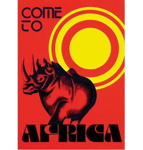
Come to Africa - Designed by Gerard van de Voort - c1975
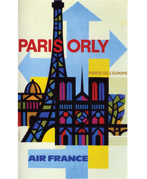
Paris-Orly for Air France c1962- Design & Illustration by Jaques Nathan Garamond
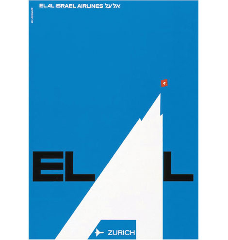
Switzerland poster for EL AL Israel Airlines - Design by Dan Reisinger
via Grain Edit
Visual/Verbal
Visual/Verbal
Excercise Objectives:
Create a design that communicates visually the meaning of a word of your choosing. The design will consist of the word and no other elements. You must communicate the meaning visually by the typeface you select, the placement of the word within the composition, the scale of the word, and other formal considerations. You must not create an image or a “picture” illustrating meaning of your word.
You are charged with supplying a list of words to work on. Challenging words are worth the effort; shun the easy solution. You will need to provide definitions for each of your words. The definitions will help guide your solution, and will also assist us as we critique the success of your designs. Remember that you are conveying the meaning of your word - it is essential to know the multiple meanings of the words you are working with.
You may use only Helvetica, Univers, Garamond, Caslon. This includes all versions (fonts) of each typeface.
Final Submissions:
Accentuate, Quotient, Meter, interject


Excercise Objectives:
- Learn to communicate meaning typographically.
- Continue to develop idea-generation and design process skills.
- Consider the form and meaning (abstract and symbolic characteristics) of letterforms.
- Consider the visual information communicated by typeface.
Create a design that communicates visually the meaning of a word of your choosing. The design will consist of the word and no other elements. You must communicate the meaning visually by the typeface you select, the placement of the word within the composition, the scale of the word, and other formal considerations. You must not create an image or a “picture” illustrating meaning of your word.
You are charged with supplying a list of words to work on. Challenging words are worth the effort; shun the easy solution. You will need to provide definitions for each of your words. The definitions will help guide your solution, and will also assist us as we critique the success of your designs. Remember that you are conveying the meaning of your word - it is essential to know the multiple meanings of the words you are working with.
You may use only Helvetica, Univers, Garamond, Caslon. This includes all versions (fonts) of each typeface.
Final Submissions:
Accentuate, Quotient, Meter, interject
Alphabetic Form/Counterform
Alphabetic Form/Counterform
Exercise Objectives:
Exercise Objectives:
- Identify the essential characteristics of a letterform (letter itself and typeface).
- Analyze the balance of positive and negative space in a composition.
- Utilize cropping and the edges of a composition.
- Use thumbnail sketches and roughs to help generate and focus ideas; begin to work with the “design process.”
- Use the process of drawing as a method to see and learn about form.
- Develop production/presentation skills (accurate cutting, mounting, measuring).
Final submissions


Typeface: Adobe Minion Pro Display
Letterforms (top to bottom) :
- "t"
- "K"
- "g"
- "R"
Subscribe to:
Posts (Atom)
